Bar Chart Introduction
Description
A Bar Chart represents model data as a graph of vertical bars. Most commonly a bar chart is used to display one-dimensional data. In that case, every element in the domain is placed along the x-axis, and a bar is drawn for every element. The height of the bars depends on the values of the identifier(s). You can create a one-dimensional bar chart by displaying:
A single one-dimensional identifier.
Multiple scalar identifiers.
A single scalar identifier for multiple cases.
It is also possible to display two-dimensional data in a bar chart. The elements associated with the second dimension are then displayed by stacking or grouping bars for every element along the x-axis. You can create a two-dimensional bar chart by displaying:
A single two-dimensional identifier.
Multiple one-dimensional identifiers.
A single one-dimensional identifier for multiple cases.
Multiple scalar identifiers for multiple cases.
In addition, you can add one or more horizontal lines to a bar chart. You can use these lines, for example, to display bounds or critical values for the displayed data. Every horizontal line is associated with a single scalar value in the model.
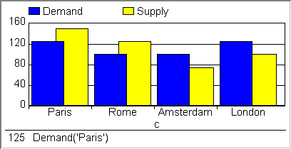
An example of a bar chart is shown below.
How to …
Learn more about